Welcome to the cyber-home of Dave, Ginny, Natalie and Clara. Actually it's more of a home for Dave, as Ginny feels this web page stuff is rather pointless, and Natalie and Clara really don't care either. However, I felt that I was obliged to include all of the household in this collection of all important things.
This website was quickly revised in April 2020. Being in COVID-19 apocolypse shelter in place for the past few weeks, and with the prospect of many more weeks, I felt like it was time to update this thing. And I just wanted to get something fresh out.
Full disclaimer: Nothing on this website should be taken seriously. It's all opinion. The photos are all real, though. No deep fakes.


I couldn't find a good source of COVID-19 data that was presented in the way that I wanted to see it. So I made my own. The media is hysterical and the US government is mostly an uncoordinated crap-show of a disaster.
Data is all is sourced from Johns Hopkins github page. Links are below. I'm not publishing data automatically (yet) so I update the charts manually when I get moving each day. Gives me something different to do.
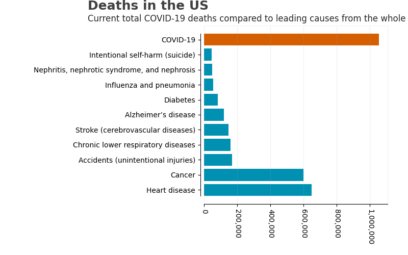
I should also point out that per the CDC, Influenza and pneumonia killed 55,672 Americans in 2017.
Data source links:
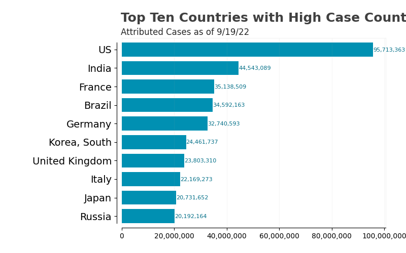
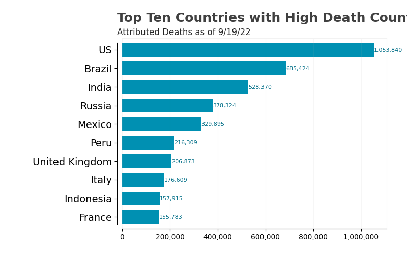
The sad Top Ten Countries in cases and deaths.
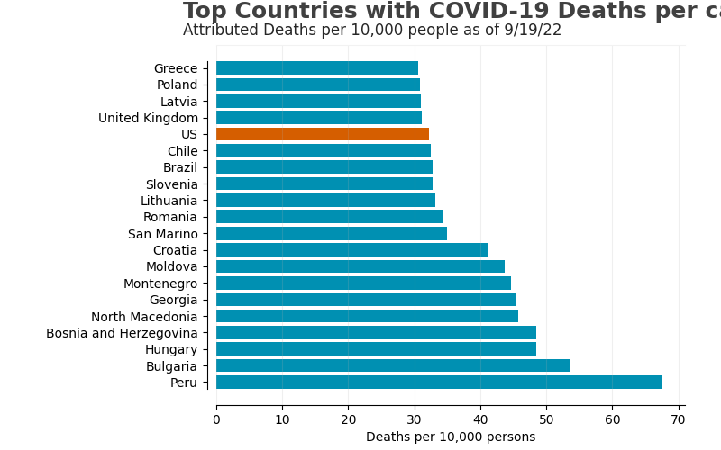
The sad Top Twenty Countries in deaths per 10,000 people.
How the current COVID-19 atttributed deaths rank compared to other leading cuses of death in the US.
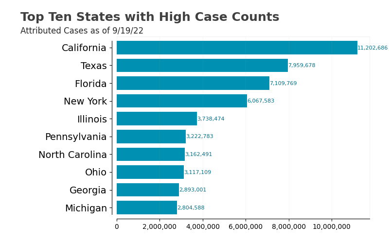
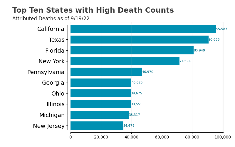
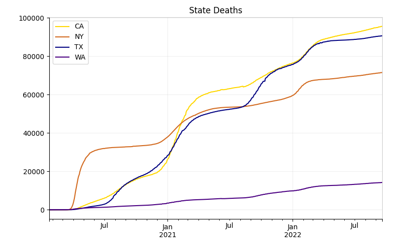
The sad Top Ten US States in cases and deaths.
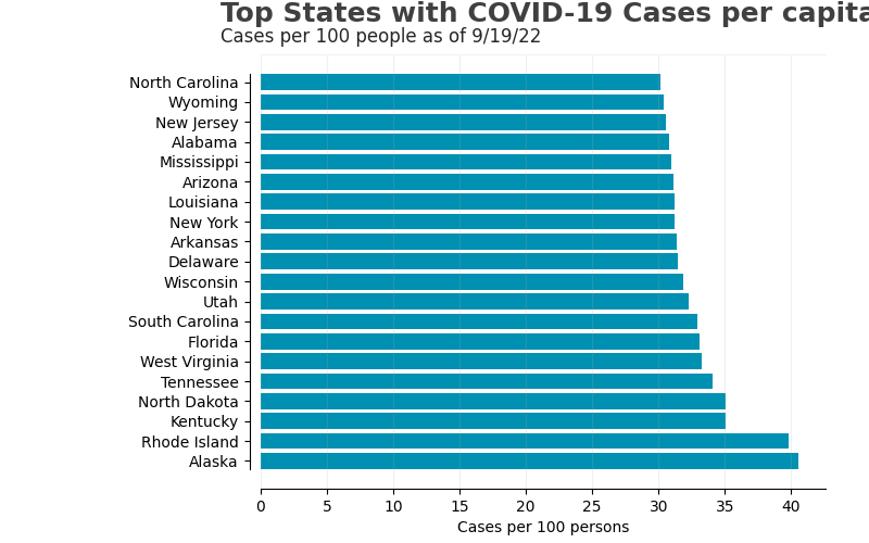
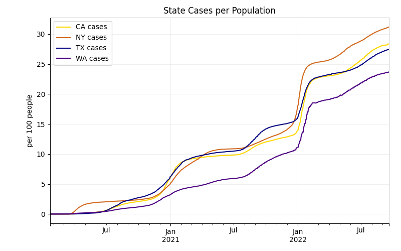
The sad Top Twenty States in cases per 100 people.
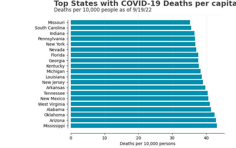
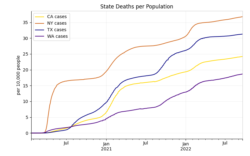
The sad Top Twenty States in deaths per 10,000 people.
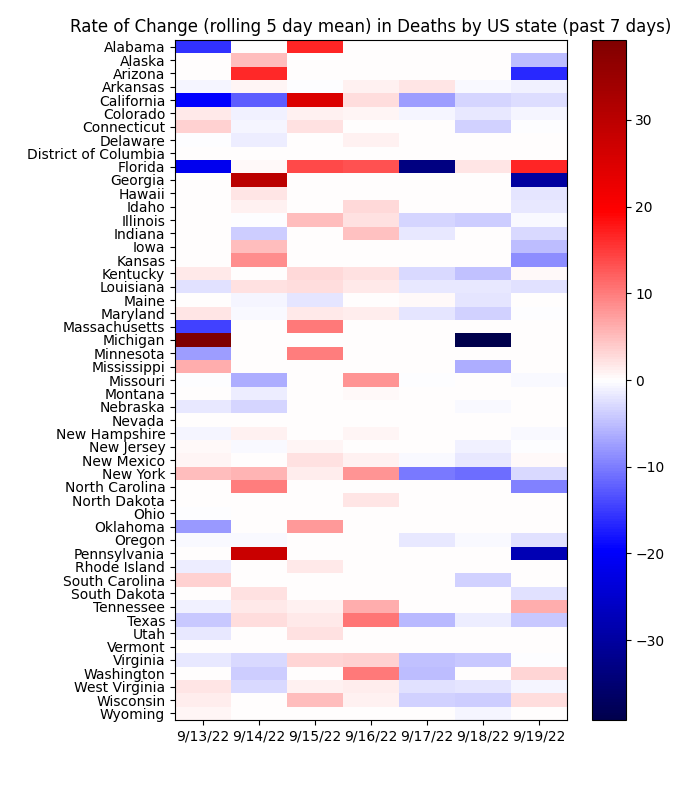
These are heatmaps that show the second derivative in terms of the daily change in cases and deaths. The darker the red, the higher the positive rate of change in the daily values (it's a bad thing - means the cases are accelerating). A whole week of red is really bad news. The bluer days, the more negative rates of change, is good as it means the rates are slowing down. A whole week of blue means really good news. White means no change.
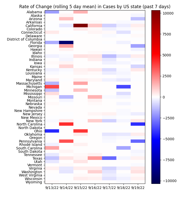
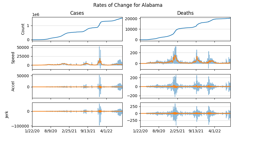
There is a green drop-down button just below that allows you to choose the state and get the derivatives plot for the cases. The break down is this...
The first plot is the total number of cases over time.
The second plot is the first derivative of that - basically the daily change.
The third plot is the rate of change - how fast the daily rate is changing. In motion terms, it's the acceleration.
The fourth plot is the rate of the rate of change, or how much the acceleration is changing each day. In motion terms, that's the jerk.
The orange curves are the rolling 5-day averages. Why 5-day? Because. The instantaneous numbers are too volatile and most likely misleading due to reporting issues and just stuff. A 7-day averaged seemed too slow. So I went for the middle ground. Those rolling averages are used in the heatmaps above.
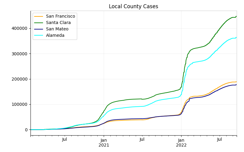
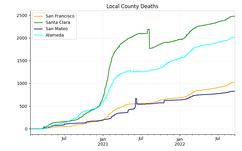
Here's the very local data in the Bay Area.
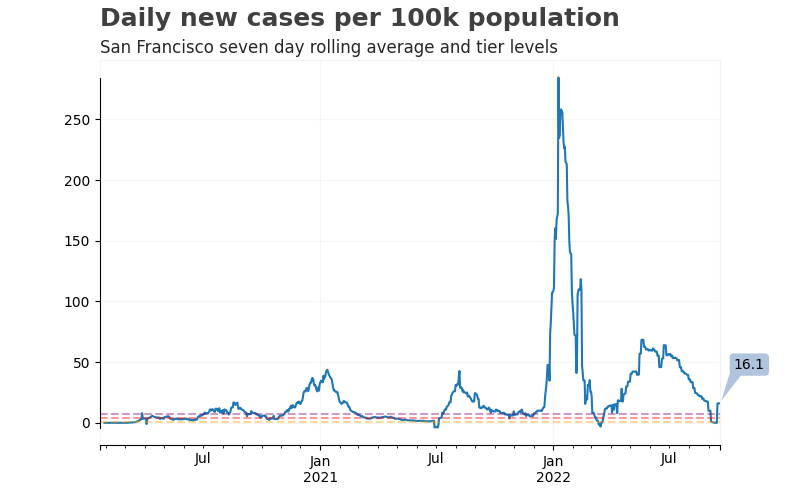
California's tiered COVID indicator assigns counties colors based on a 7-day average of new cases (Read more here). It also takes into account the positivity rate, but I'm not going to find those numbers. The different level thresholds are represented by the dotted lines in the trend below. This is important because there will be no chance of public in-person school without the county dipping into the red tier (at least per the current plans).
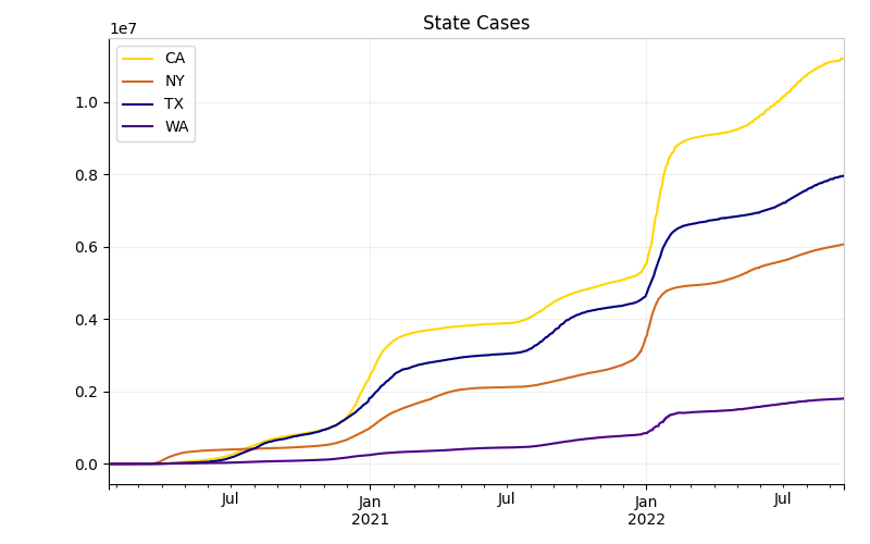
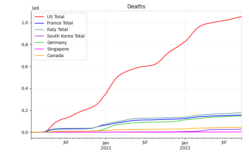
Some key states that I am watching, including adjustments for population.
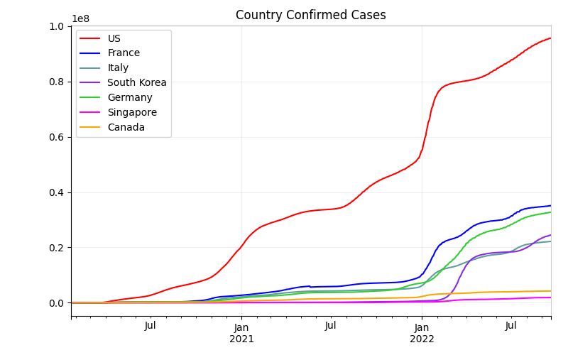
A few key countries.
Now I want to combine things and look at some comparisons.
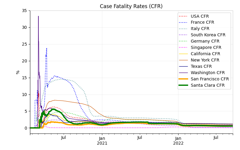
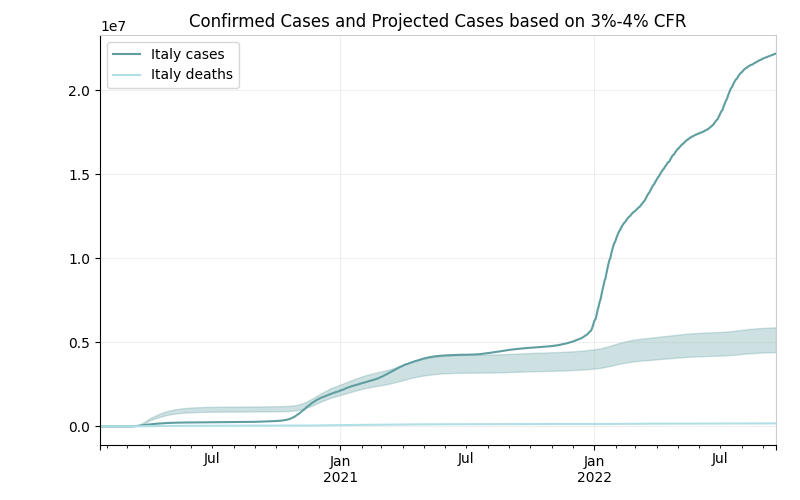
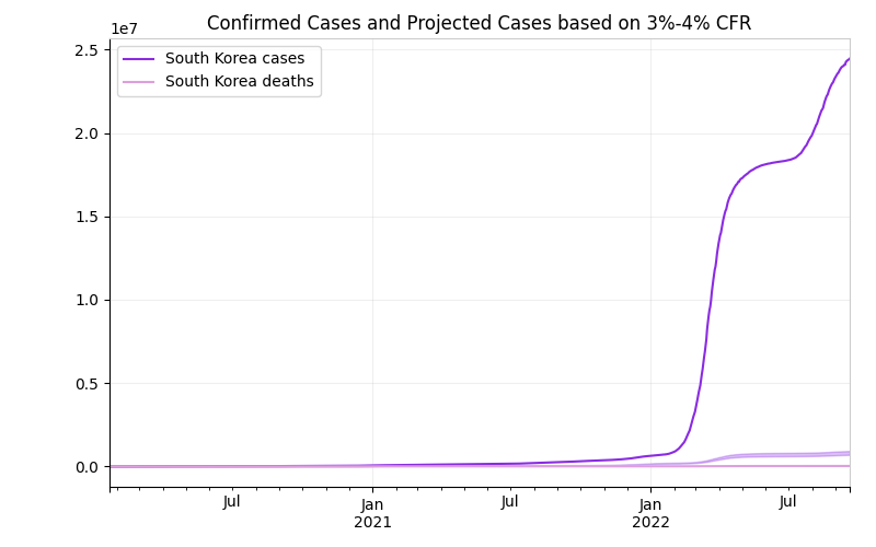
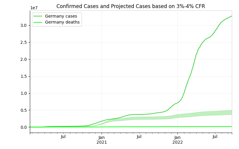
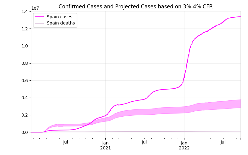
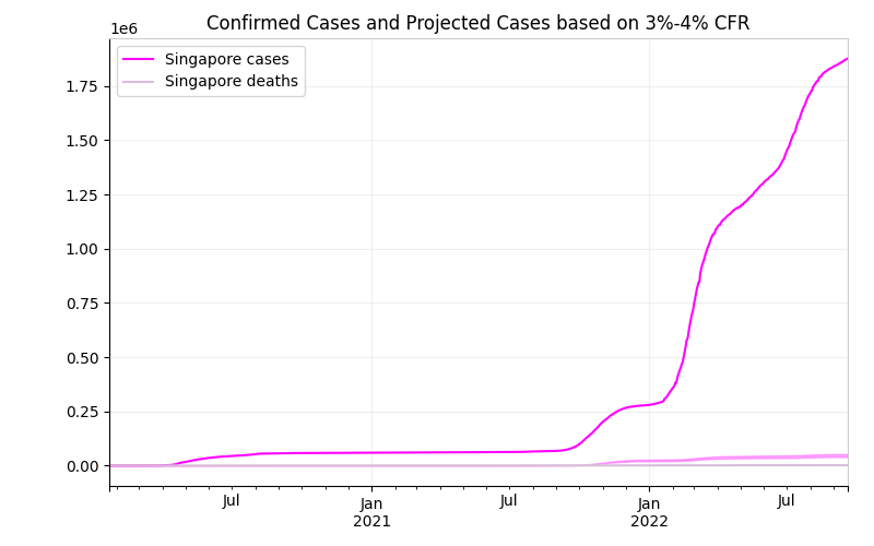
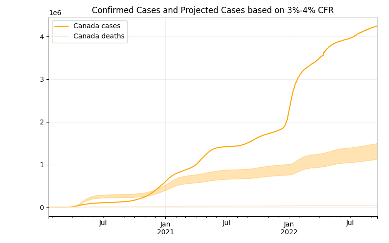
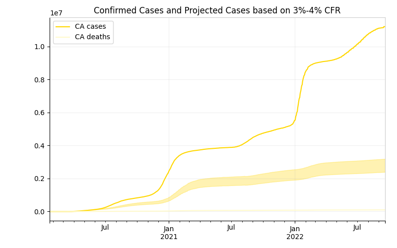
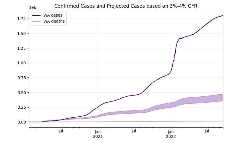
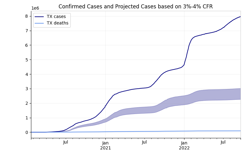
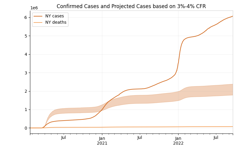
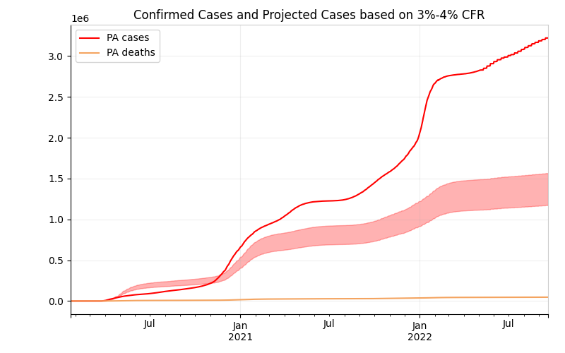
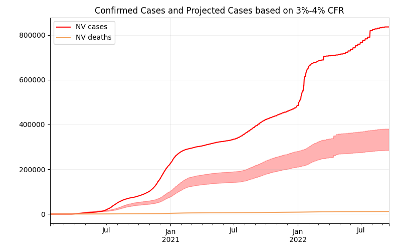
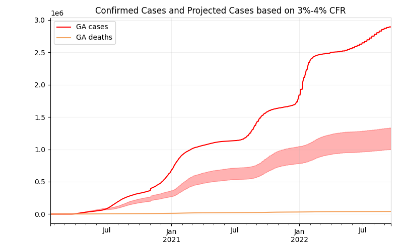
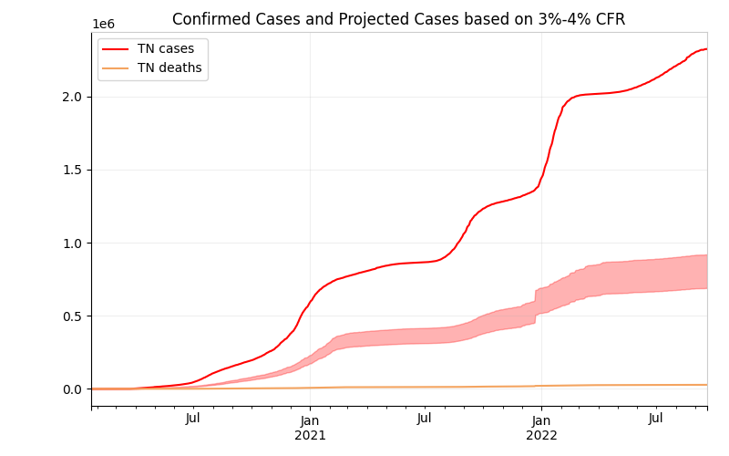
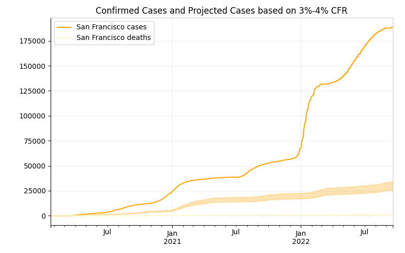
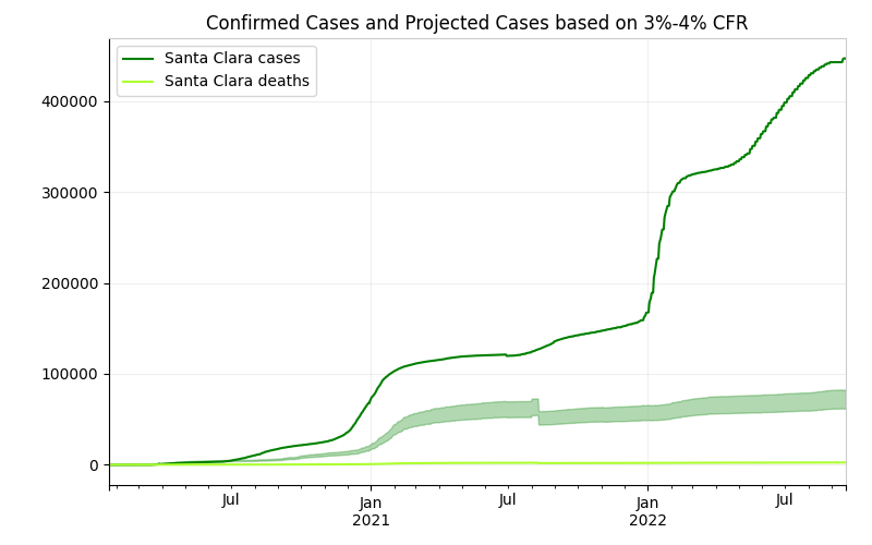
This first is CFR (Case Fatality Rate). Recent Analysis by the WHO points to a 3.4% Confirmed Fatality Rate (src). It was 2% early on but has steadily risen. This seems to be backed up by where most of the data at individual locations is heading.
France and Italy are not close to that. That sucks.
Much US data is heading towards that 3-4% mark. Note the jumps at the beginning. Probably due to lack of any testing to get good numbers.
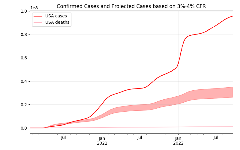
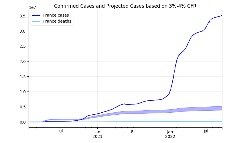
Next is using that 3-4% CFR to then back predict the real number of cases in the location. That 3-4% band is shown in a light color along with the confirmed cases. When they don't match up, that hopefully means testing is either too limited or much more widespread (maybe - South Korea). Worst case is it means that the health care system is not operating correctly.
So in an optimistic world, if the case curve is above the projected cases, then the location is doing an excellent job of keeping infected patients alive. And their CFR will be much lower in the end, which mean less deaths. And they are possibly doing good testing. If the curve is below the projected cases, then they just haven't kept up with the testing.
So in an pessimistic world, if the case curve is above the projected cases, then the location is doing an excellent job of keeping infected patients alive and spreading out the cases, but in the end they area also just spreading out the deaths. And they are possibly doing good testing. If the curve is below the projected cases, then their actual CFR is high and they are having a health care collapes (or an older population, or a sicker population, or something else which I have no idea about because I've got no knowledge of health care systems and research).
Either way, I think that having the case curve above the projected cases is a good thing as it means deaths are being spread out or at least staying low which helps the whole health care system and society better cope with it all.
Or all that I wrote above can be ignored (at least for US numbers), because the US is evidently sucking at reporting COVID-19 deaths (src). So really nothing can be believed and we'll read about it in the history books someday...if there is a history...if there are books.
Grouped by type (Country, state, county) of location.
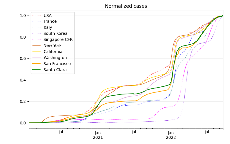
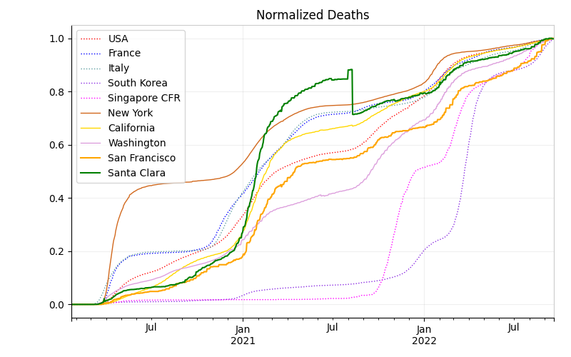
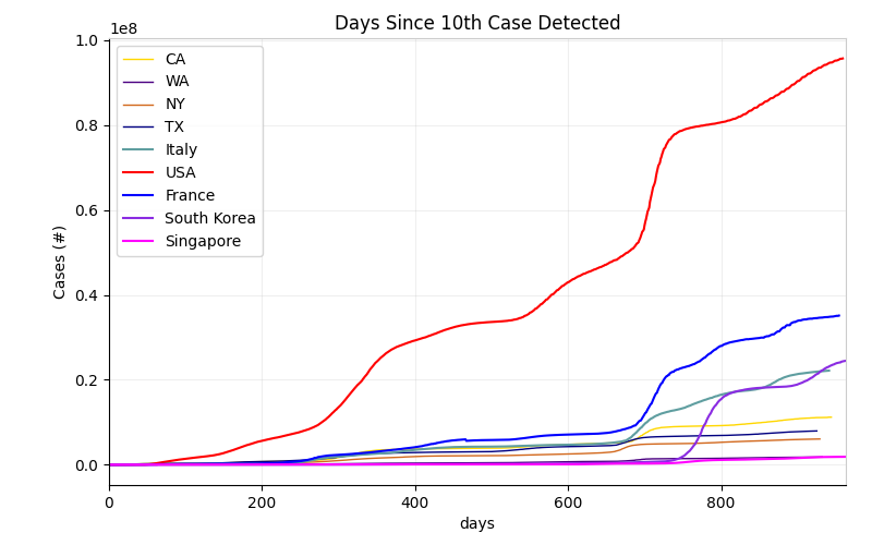
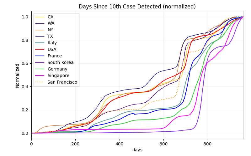
And finally, here are some normalized curves and other ways to look at the data.
For each location, I took the maximum cases and then normalized the data from 0 to 1. Hopefully all locations look like South Korea soon.
This looks at the progression from the 10th confirmed case in terms of the number of days after that 10th confirmed case.
This looks at the progression from the 10th confirmed case in terms of the number of days after that 10th confirmed case with the cases normalized against the maximum for that location.
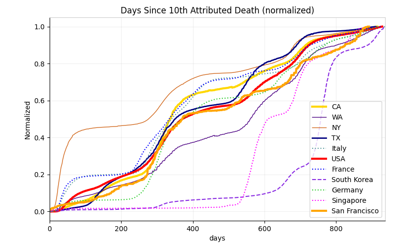
This looks at the progression from the 10th death in terms of the number of days after that 10th death with the deaths normalized against the maximum for that location.
![]()

More informative stuff is coming. We've got lockdown until at least June 1st.